😀 CSS with Bootstrap and Flexbox
CSS
CSS is a standard technology to tell the browser how the web components should be displayed on the screen. But mobile webs or native apps the idea is also very similar. And it turns out there are lots of useful libraries that could help you arrange the layouts on a website or the mobile devices. I’ll list of few of them below.
Bootstrap.js
Grid system
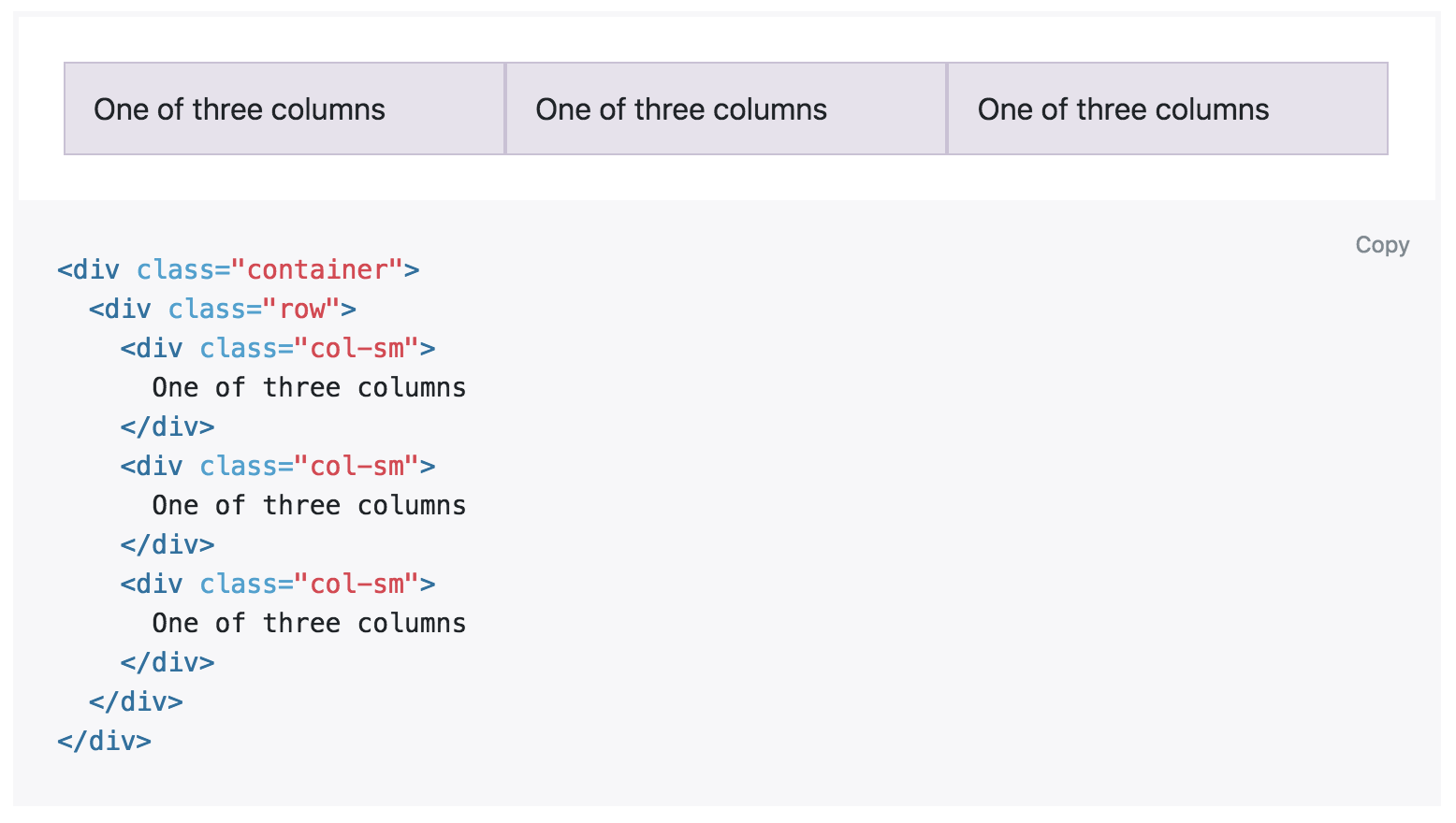
A screen is divided into 12 parts horizontally. You can use those classes to control the row and column layouts.
Also it used CSS3 tricks to detect your viewport size and check whether it is a mobile device, an iPad or a normal screen. You can use different classes to control layouts in different viewports.
Tables
There are some useful properties in a table class. All you need to do is give your table .table class name.
.table-striped is for alternating rows.
.table-hover is for mouseover effects.
Forms
.form-inline class will grant display-inline property to all form elements.
.readonly class will make the input field read-only
You can wrap the input fields inside a form with div elements with .form-control class.
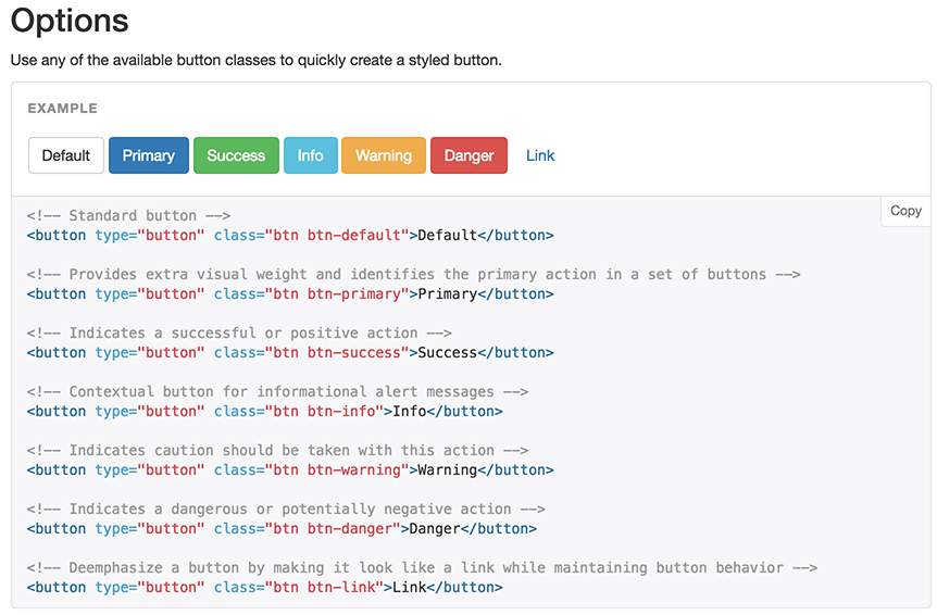
Buttons
.btn .btn-default .btn-primary … etc will give styling to your buttons. easy
.btn-lg .btn-sm .btn-xs will give you buttons with different sizes
Flexbox (in React Native apps)
flexbox aims to provide a more flexible way to design your layout.
It can move around objects within a container easily. A flex container can expand items to fill available free spaces, or shrink the items to prevent an overflow.
.container {
  display: flex; /* or inline-flex */
}
All you need to do is grant .container property to a View.
When we use flexbox, we can arrange the children of a container in two directions, vertically or horizontally.
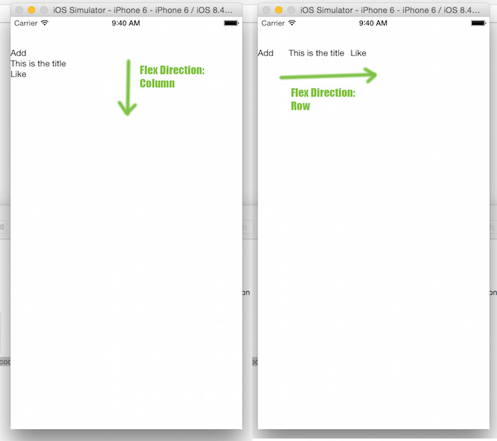
flexDirection:'row' you can give this styling to a View so children elements can align in the direction you want

.container {
  justify-content: flex-start | flex-end | center | space-between | space-around;
}
justify-content property is especially useful for headers.
flex-grow, flex-shrink this expands or shrinks the elements to fit the entire width.

Miscellaneous
Bootstrap is very big. Even the minified version has over 100 kb in size.
–
references:
- http://getbootstrap.com/
- https://css-tricks.com/snippets/css/a-guide-to-flexbox/
- http://moduscreate.com/react-native-layout-system/
- https://www.w3.org/TR/css-flexbox-1/#property-index
30 Jun 2016